
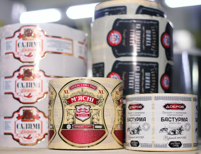
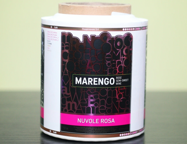
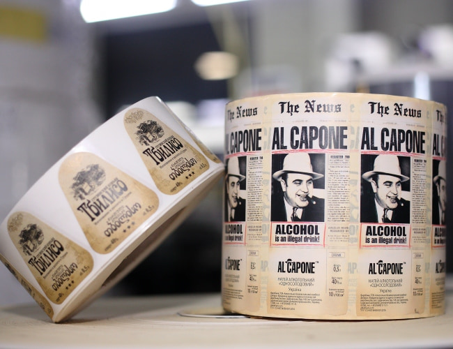
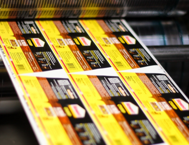


Finish of an advertising label – logo and slogan
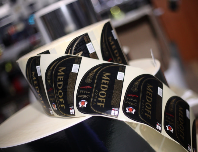
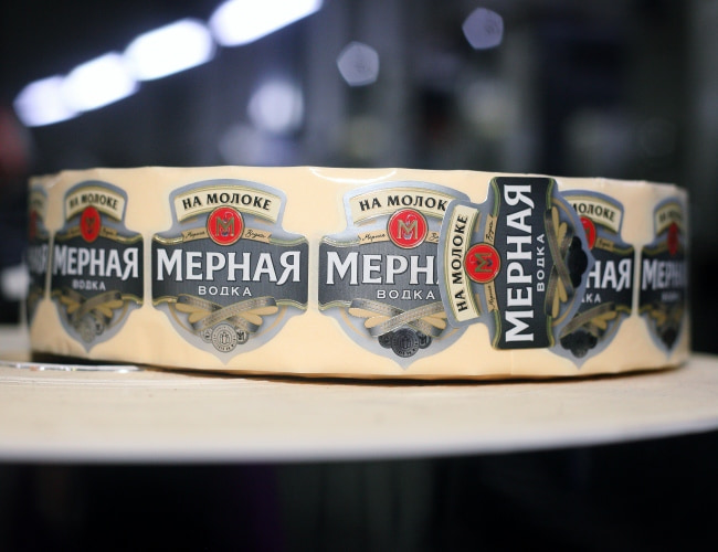
Logo and slogan are inherent elements of a modern label. The logo is a distinctive element that makes the brand recognizable and stands out from the competition. The main purpose of the slogan is to stimulate buyers to purchase one or another product. Taken as a whole, they are becoming one of the main keys of recognition of your product, they affect the psychology of the buyer, help him or her better understand what kind of product is in front of him or her and why it really deserves attention.
Generally, there are no requirements to slogan and logo in principle, but certain recommendations. Buyers are more responsive to short slogans of up to 4-5 words, which demonstrate benefits to them. For example, “Power of nature for your health”, “Secret of your beauty and strength" etc. Also well accepted are the slogans that effectively highlight the advantages of the product itself over competitors. In some cases you can get along without a slogan at all, but its availability is definitely an important advantage.
In relation to the label logotype, it should not take up much space, but should be noticeable and memorable. You have probably noticed that it is very difficult to find logos with a large number of small elements and colours. In recent years there has been a thirst for minimalism and simplicity. We may immediately recall Coca-Cola brand logo, which appeared at the end of the 19th century but has not changed much and is a white scripted text on a red background. Another one is the logo of Apple. Its products are known around the world at a glance.
TEXT IS AN INHERENT PART OF ANY LABEL
We provide a list of key requirements to the text design:
- Large and bold fonts. Most commonly used for labels on durable goods and large packages.
- Thin fonts. Such fonts are typically used to emphasize the elegance of the product, the finesse and complexity of assembly.
- Antique fonts. They are less common, but still can be found. Mainly used for labels on antique products.
- Colour is an important factor affecting human perception. Nowadays, people best perceive green and red text on a white background. For example, in advertising red and white colours prevail quite often. Whereas, red is a great accent colour.
- Any text is memorized at its beginning and at the end. If you wish to convey important information to the buyer, it should not be placed in the middle of the text. And due to the fact that the buyer does not always read the text to the end, the beginning of the label text is the most important.
On any label, the reader can grasp, on average, 56 words. It is strongly recommended to place all necessary information within this range. Otherwise, its substantial part may simply get lost.

HOT TO TAKE FULL ADVANTAGE OF THE LABEL?
Here are the main methods that will help to significantly increase the chances that the label will attract more attention of the buyers.
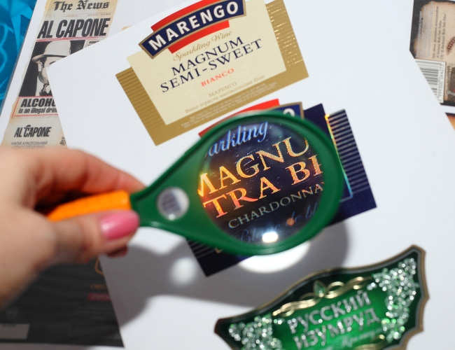
- Use of coloured labels. In any case, bright colours, irrespective of the filling will be a more winning choice than single-colour labels. And in terms of attracting the eye, the filling itself will recede into the background.
- Rejection of oblique types. As practice shows, the inclined font can play a cruel joke with the saleability of products. Largely due to the fact that the readability of the text is distinctly reduced.
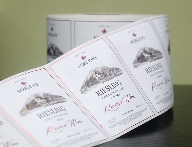
- An important role is played by quality illustration. It is important to retain the full-fledged relationship between the graphical filling and the text.
- An excellent way to increase the credibility of the product is a photo of a celebrity on the label. This practice is used in the USA.
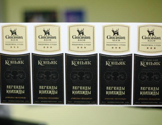
- Black colour on yellow background is also a winning option. Black business cards with yellow (gold) letters look gorgeous.
ADDITIONAL TIPS FOR LABEL FINISH
Try not to use too much text. This burdens the label with a lot of information which is not always important to the buyer. The fewer words you use, the greater will be the chance that they will stick in the memory. The particular brevity in this regard is your strongest card.
Correctness is a must. Any error in the text is a direct way for reduction in sales and income.
A label or sticker is the face of your company. Therefore, it should be treated with as much responsibility as the product itself, and sometimes with even more responsibility. A quality label is the key to your success!